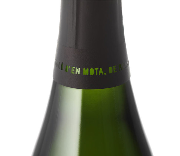
Turó d'en Mota 2009
Cavas Recaredo commissioned us to do the design of this fabulous ten-year-old cava. Although their method is traditional, this product is a novelty in our country, so they suggested using a small label, with little information, a new modern look.
Turó d'en Mota represents the elegance of simplicity: a unique vineyard, a single grape variety, one vintage and a production of only 2973 bottles.
The main difference of this product resides in the care of the vineyard, with a viticulture of observation rather than intervention. Hence, we chose the concept "minimum intervention" as a connecting thread for all the design process.
Therefore, on the main label there is nothing more than the logotype, but we used no ink: the typography is die-cut and engraved with laser on off-white cotton paper.
We haven't used ornaments nor any of the usual symbols of luxury -gold, silver, ribbons, crests-
We prefered the language of sobriety, because we believe in the seduction of those things that don't try to seduce, and we also believe that the best products don't need to show off.
For the box we chose ash wood, with a raw finish, engraved with laser, with a simple shape that doesn't require metal hinges or fittings.


